Typeface design: Wyville by Mário Vinícius for Cercle Magazine #5: Oceans
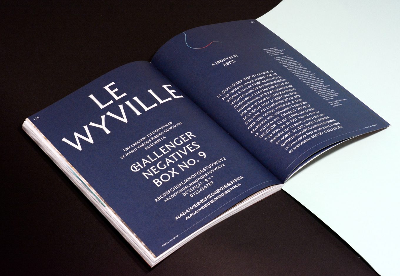
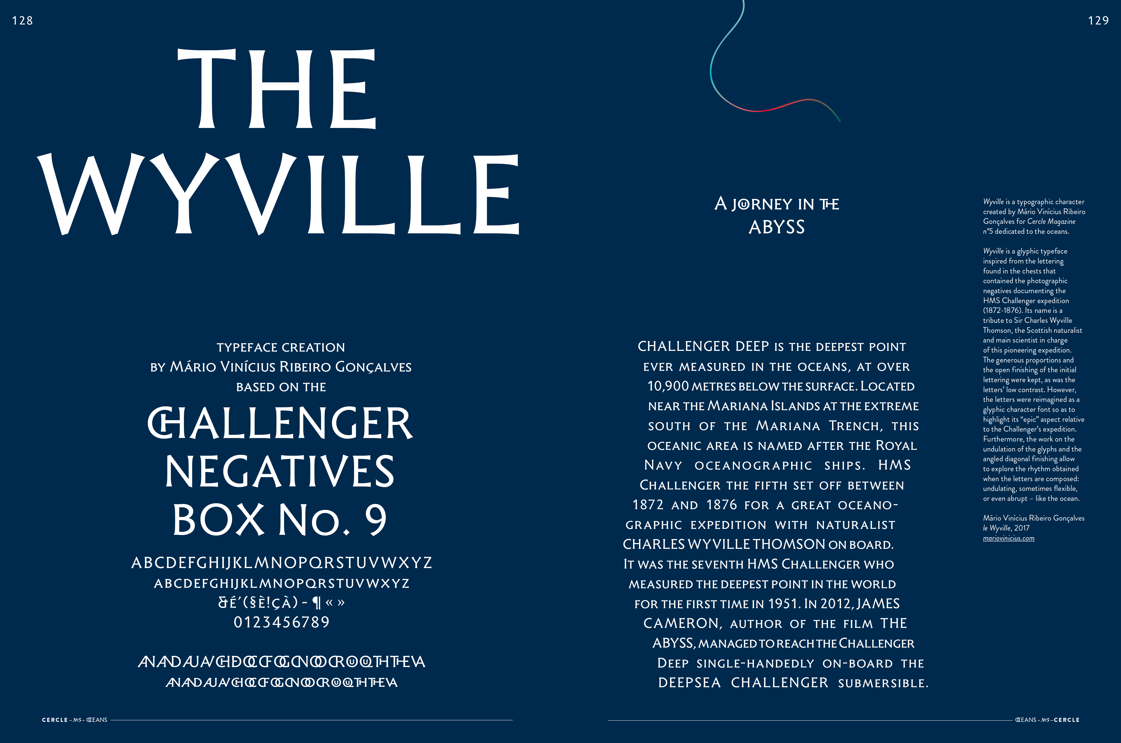
The Wyville is a typeface created by Mário Vinícius Ribeiro Gonçalves for Cercle Magazine №5 based on the Oceans topic. The Wyville is a glyphic typeface inspired from the lettering found in the chests that contained the photographic negatives documenting the HMS Challenger expedition (1872-1876). Its name is a tribute to Sir Charles Wyville Thomson, the Scottish naturalist and main scientist in charge of this pioneering expedition. The generous proportions and the open finishing of the initial lettering were kept, as was the letters’ low contrast. However, the letters were reimagined as a glyphic character font so as to highlight its “epic” aspect relative to the Challenger’s expedition. Furthermore, the work on the undulation of the glyphs and the angled diagonal finishing allow to explore the rhythm obtained when the letters are composed: undulating, sometimes flexible, or even abrupt – like the ocean.
For the fifth issue of Cercle Magazine, he has created the Wyville. Mário Vinícius Ribeiro Gonçalves is a typographer and a researcher. Born in Brazil, he now lives in Poitiers in France, where he teaches
type design and character drawing at the School of Applied Arts. Passionate about writing – shape and content – its main areas of activity and interest are typeface design, character drawing and editorial design.

Mário Vinícius’s website: mariovinicius.com
© Cercle Magazine