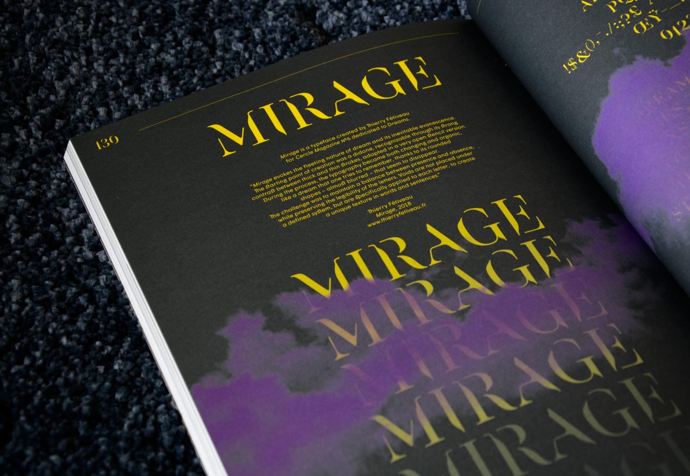
Typeface design: Mirage by Thierry Fétiveau for Cercle Magazine #6: Dreams
Mirage is a typeface created by Thierry Fétiveau for Cercle Magazine №6 dedicated to Dreams. Thierry Fétiveau is an independent font designer and graphic designer based in Nantes, France. He works internationally for large brands or smaller structures. Experiments, personal projects and typeface creation have a large importance in his process and nourrish his approach. He is a member of Carré Cousu Collé Collectif, which promotes books and its design and he writes articles about typography for magazines and websites. Thierry Fétiveau is also a typography teacher in various schools.
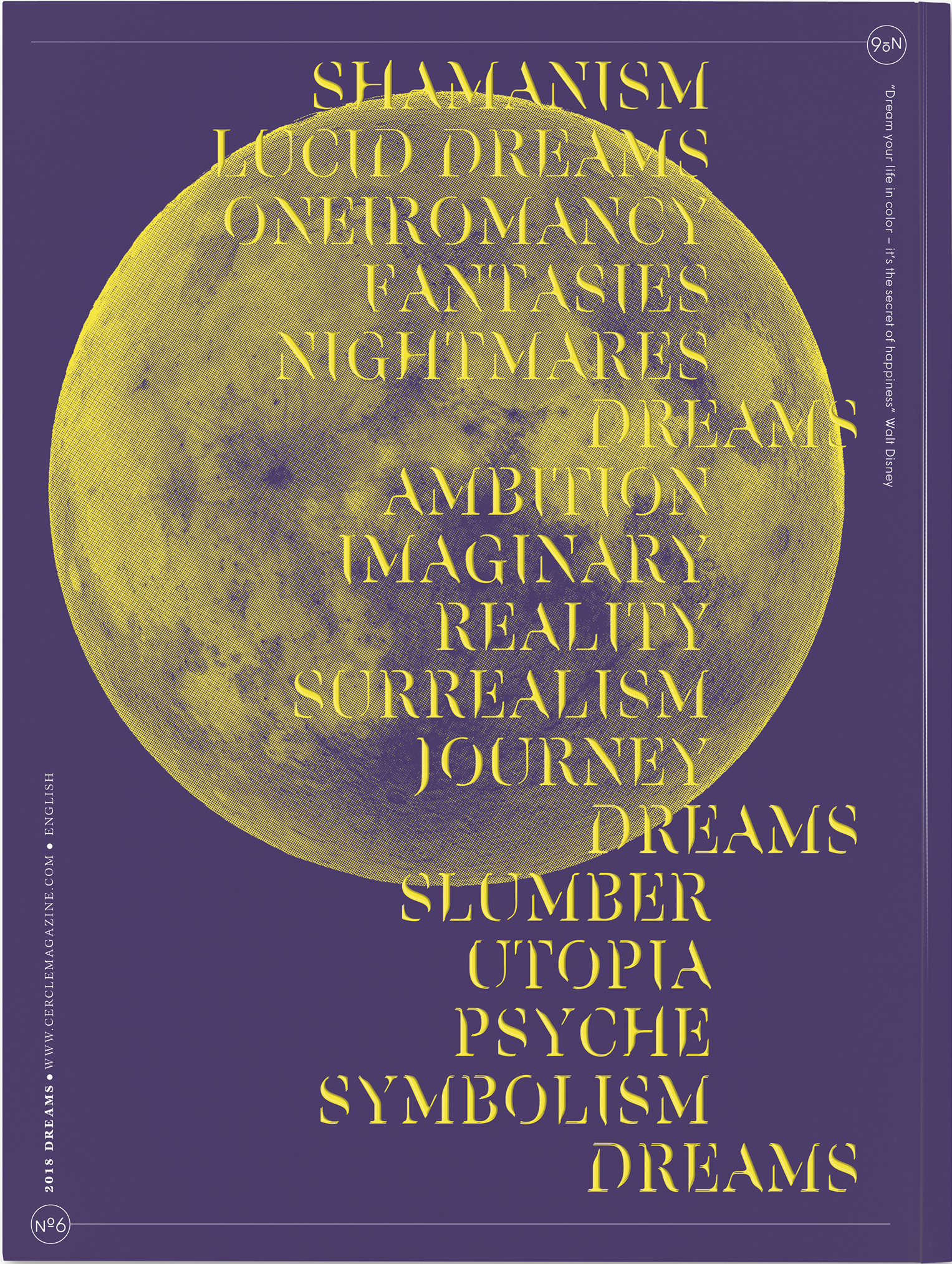
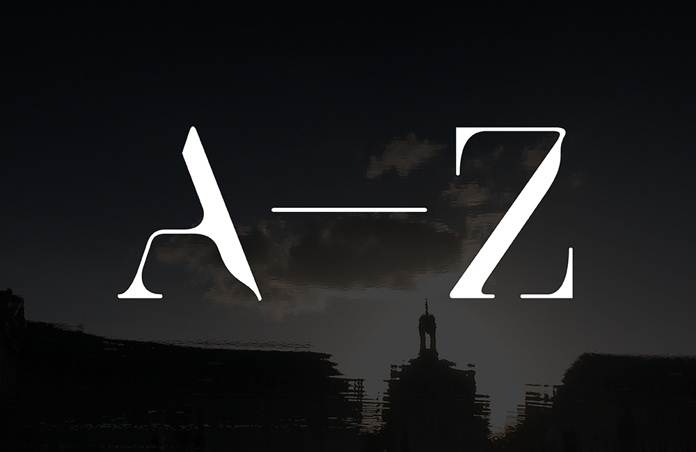
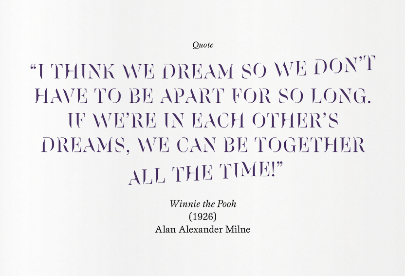
For Cercle #6, Thierry Fétiveau sign the typedesign of Mirage font. “Mirage evokes the fleeting nature of dream and its inevitable evanescence. The starting point of creation was a didone, recognizable through its strong contrast between thick and thin strokes, adapted in a very open stencil version. During the process, the typography became both changing and organic, like a dream that one tries to remember, thanks to its rounded shapes – almost blurred – that seem to disappear. The challenge was to maintain a balance between presence and absence, while preserving the legibility of the letters. Voids are not placed under a defined system, but are specifically applied to each letter, to create a unique texture in words and sentences.“
Thierry Fétiveau is currently working on a new editorial project with two friends, Clément Le Priol and Benjamin Reverdy. Bouclard-éditions is born from this collaboration, including a forthcoming magazine with several custom-made fonts. To follow this project> Bouclard-éditions.

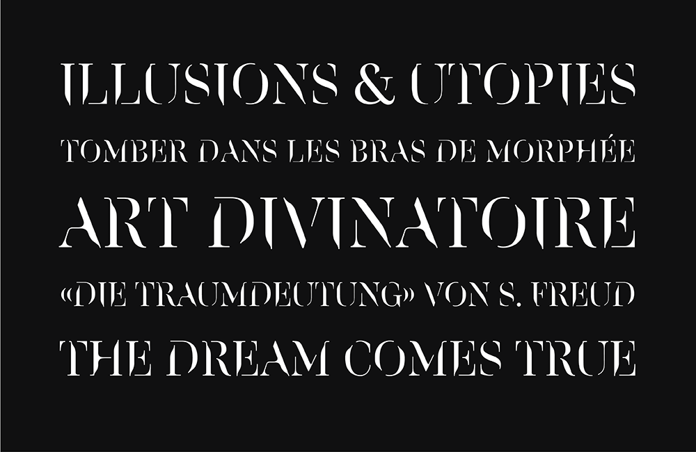
Mirage typeface, by Thierry Fétiveau, 2018
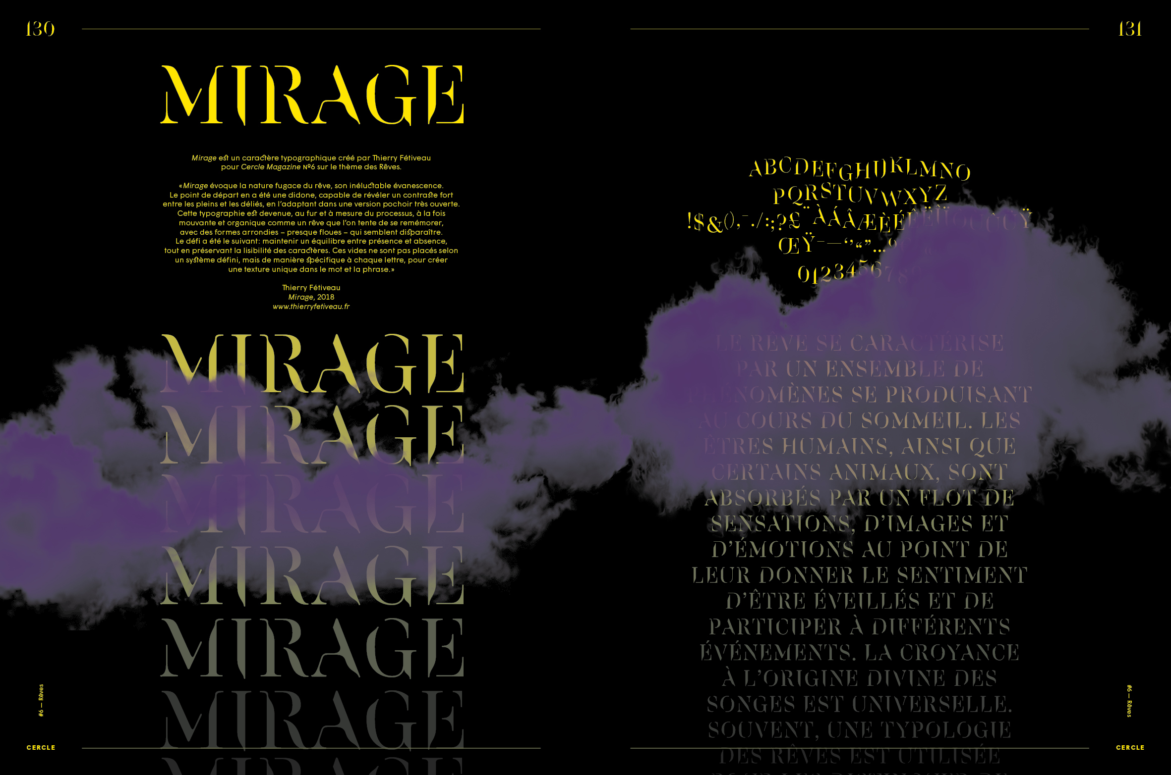
Mirage typeface, by Thierry Fétiveau, 2018
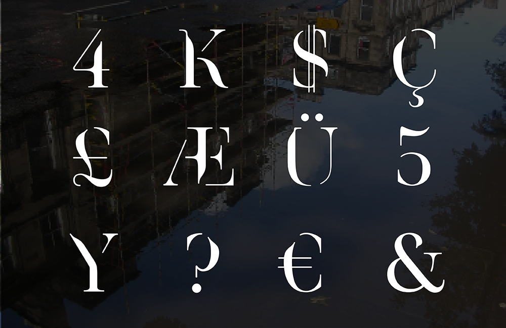
Thierry Fétiveau’s website: thierryfetiveau.fr
© Thierry Fétiveau / Cercle Magazine
