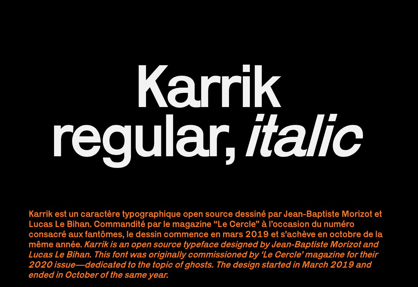
Karrik, a spectral inspiration typographic font
For each of its eight editions, Cercle Magazine entrusts different typographers with the headline’s publication font. The typography thus designed has to match the publication’s theme. It’s all about designing the letters that will be use for the headlines, the pagination, and since the new model of 2017 for the cover of the magazines, to give a strong identity to the publication. The design of typography, considered as a creation in its own right, is freely assigned to talented designers who have conceived, raising new reflections, references and approches on the current theme, without any other brake than being legible and matching with the theme. Introduction of the fontfaces drawn for the first 7 issues and Karrik, created for the 8th Cercle Magazine and available today at Velvetyne and Phantom Foundry.
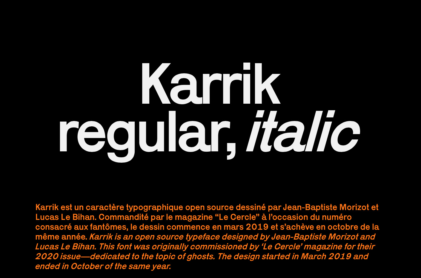
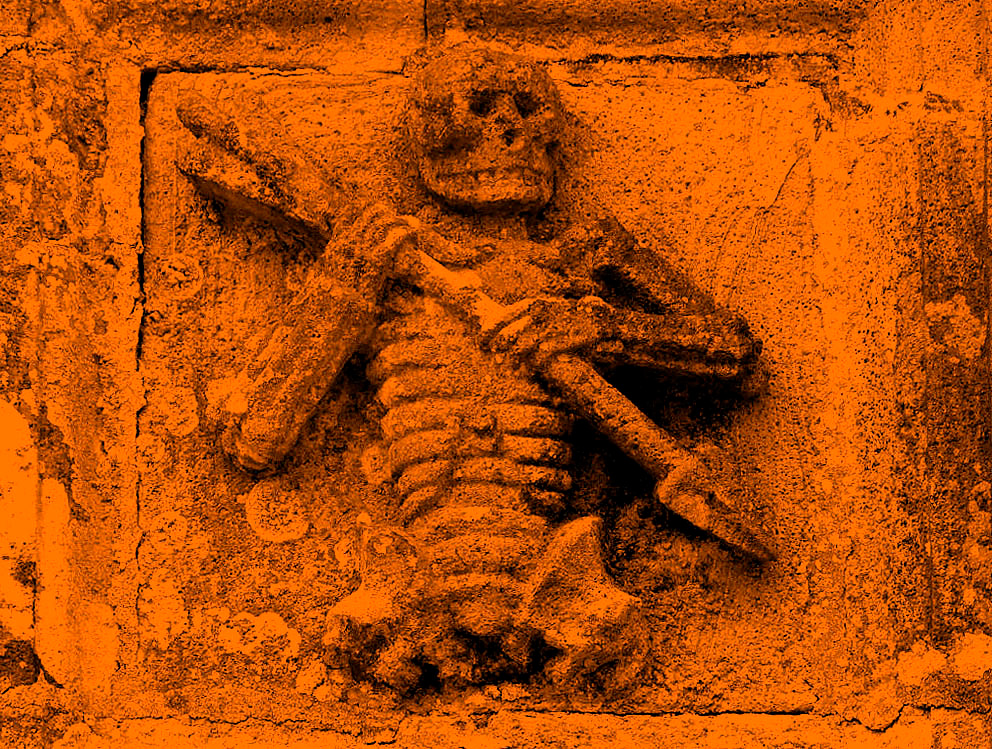

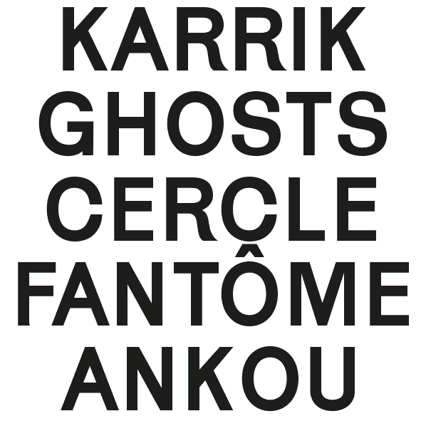
For the 8th numero of Cercle Magazine, the creation was assigned to Jean-Baptiste Morizot and Lucas le Bihan, who have developped together the Karrik, a ghostly-like typographic font. It was inspired by the Ankoù, a Breton mythological figure representing the servant of Death, whom aim is to collect in its creaking cart called Karrik the deceased’s souls. When a living hears the sound of its cart, it means he will die sooner or later. It is also said that the one who see the Ankoù will die the following year.
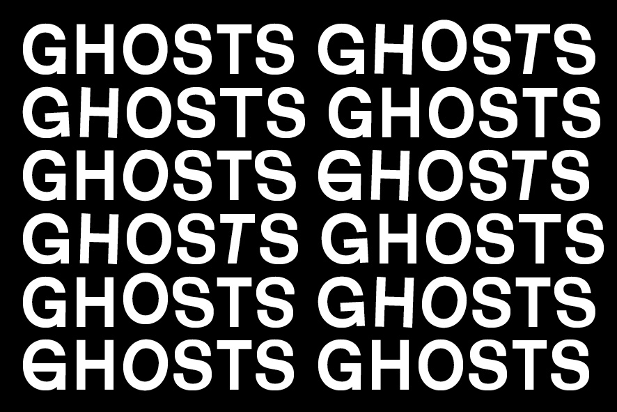
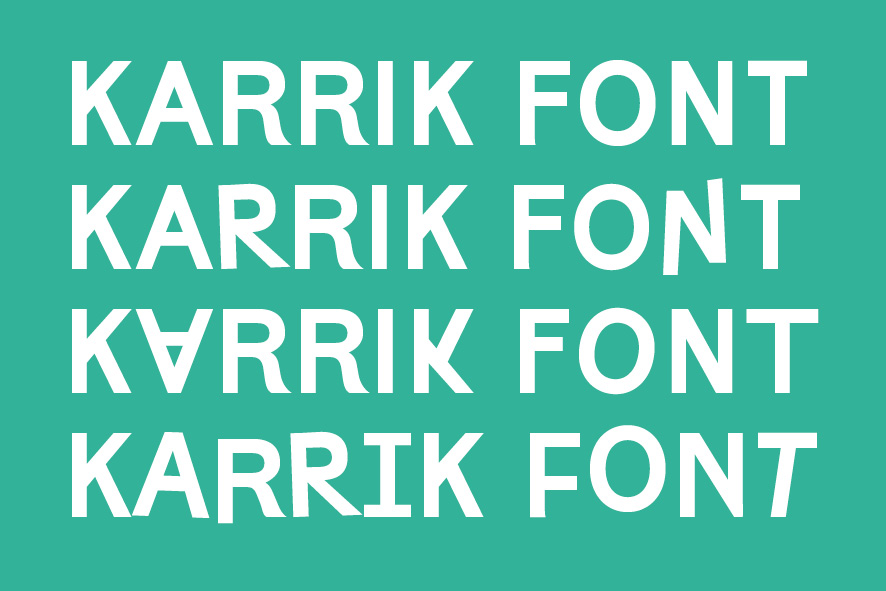
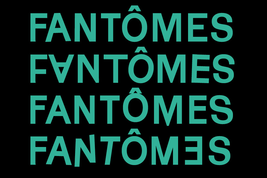
“Karrik is rooted in vernacular typography. The weight disadjustments, the lack of optical corrections, the uneven width of the letters are some of the features of early sans serif typefaces that inspired us in this boundless “reinterpretation.” We kept these features noticeable at display font sizes — but with the constraint that the typeface remains legible at body copy size. A set of random, chaotic uppercase letters has been added as tribute to the roots of Karrik; uneven garage letterings, nameless fonts of obscure and discontinued foundries.” Jean-Baptiste Morizot & Lucas Le Bihan

The Karrik drags itself along the pages of the 8th publication, with wonky letters giving the magazine a shaky aspect and a strong identity.
Karrik is a free typography available in open source >> Velvetyne foundry and http://karrik.phantom-foundry.com
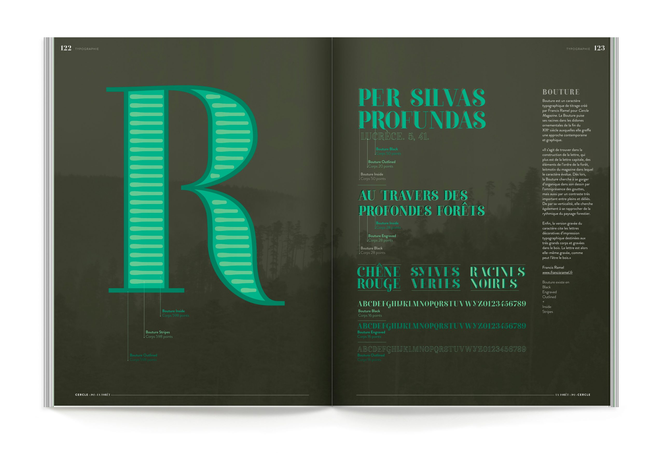
La Bouture, the first publication’s typography, Cercle Magazine Forests, was created in 2013 by Francis Ramel.

Le Nostromo, a retro-futuristic font, was created by Thomas Bizzarri and Alain Rodriguez in 2014 for the Science fiction publication.
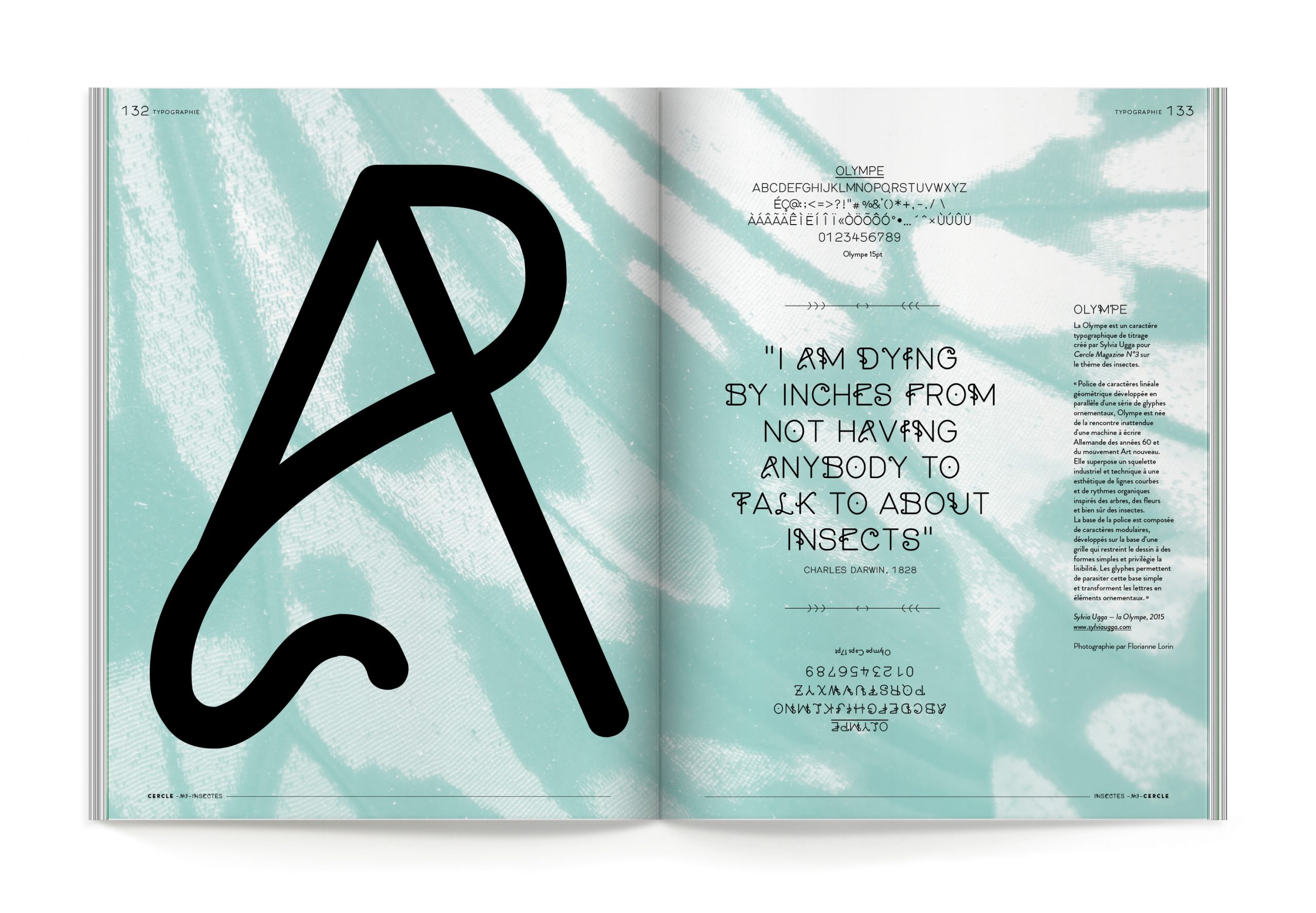
L’Olympe, a parasitic typography, was created by Sylvia Ugga for the Insects’ publication.
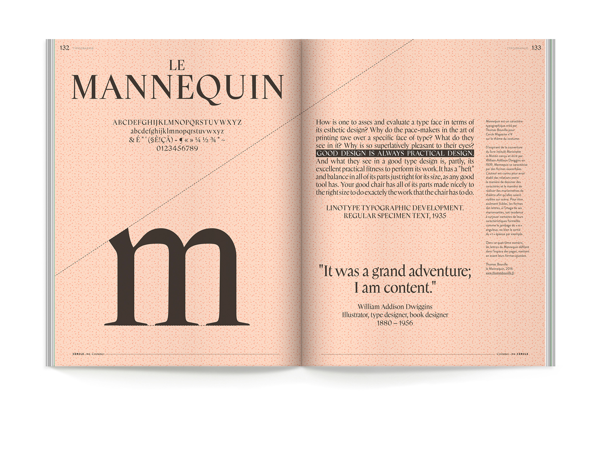
Le Mannequin designed by Thomas Bouville was used in 2016 for the Costumes’ publication.

The Wyville designed by Mario Vinicius Ribeiro Conçalves was used for all the Oceans’ edition in 2017.
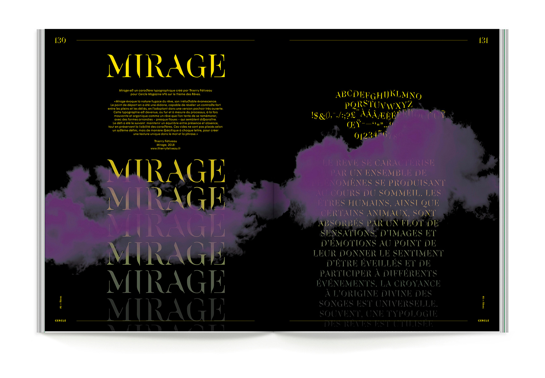
In 2018, Thierry Fétiveau conceived the Mirage for the new draft of Cercle Magazine and its Dreams’ edition.
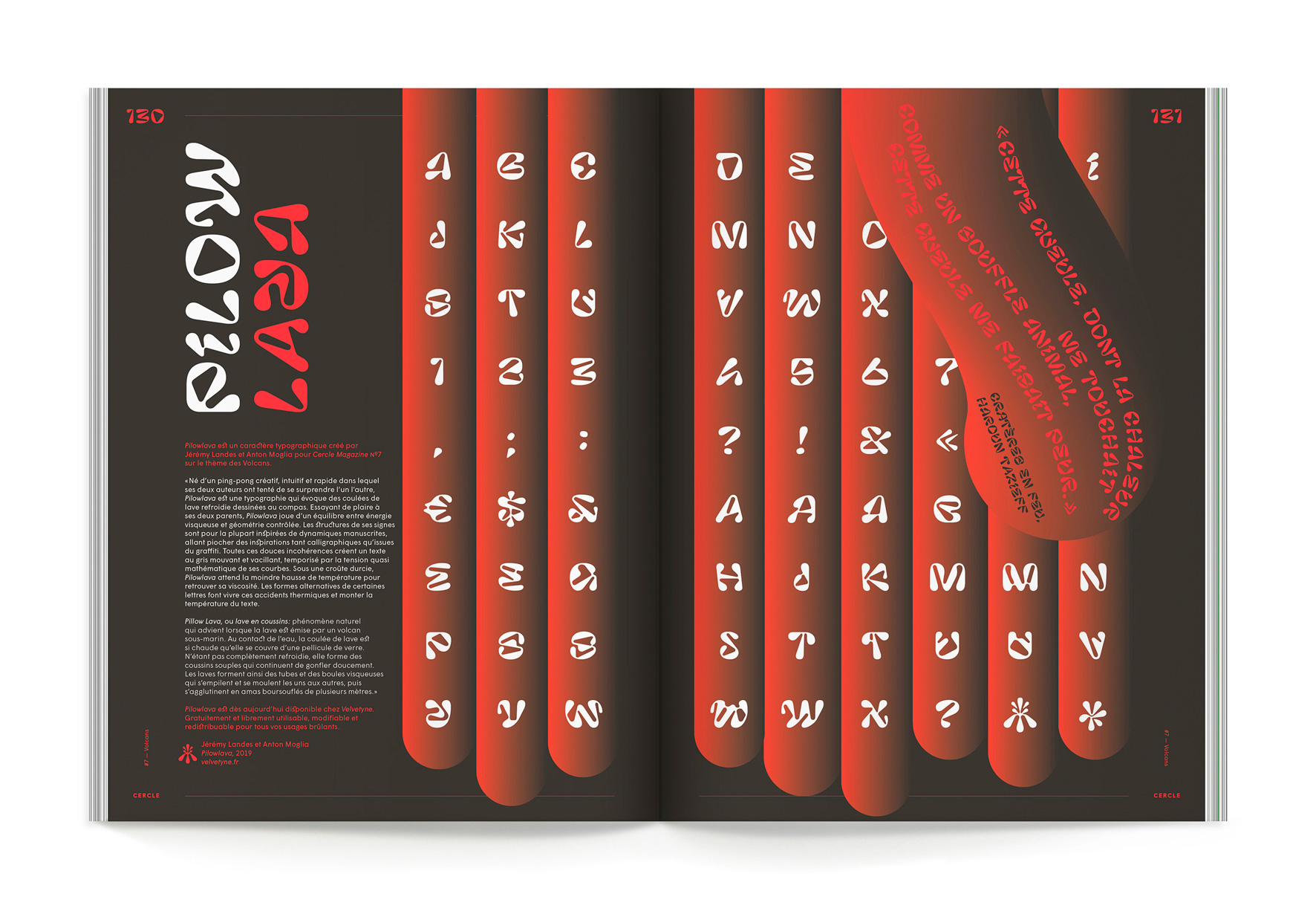
Finally, in 2019, the Pillow Lava was designed by Jeremy Landes and Anton Moglia for the 7th publication of Cercle about volcanoes.