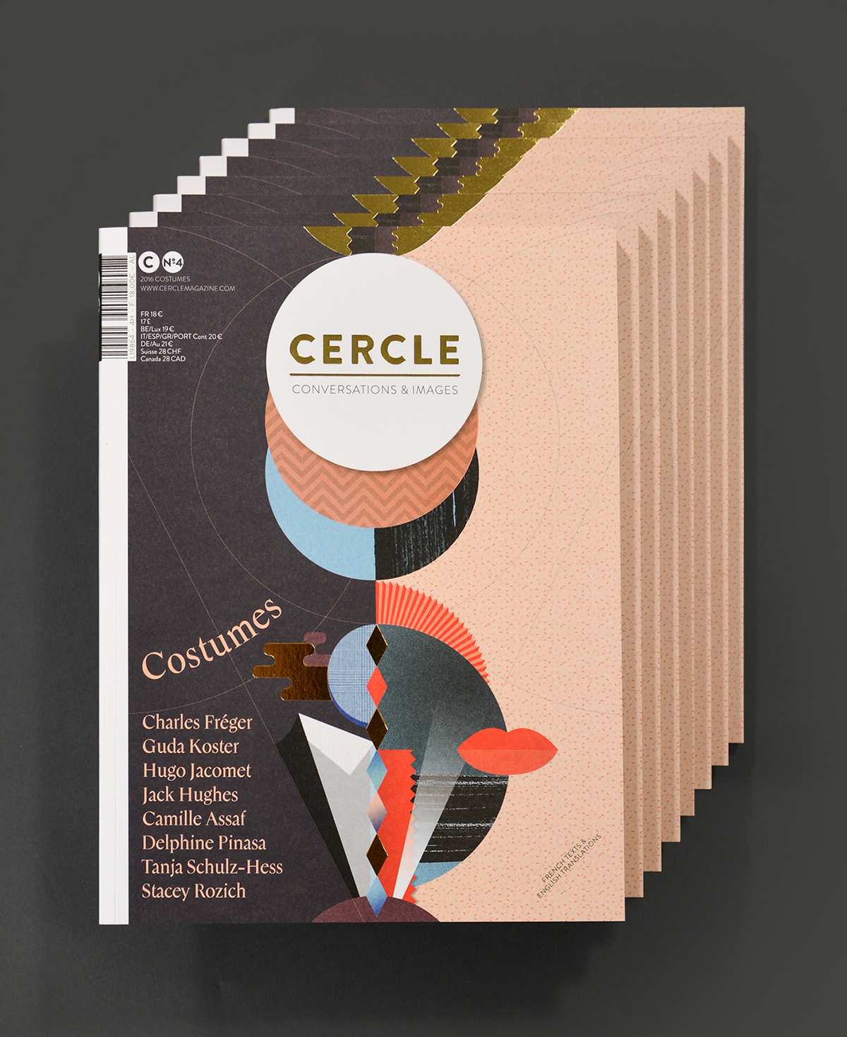
Typeface design: Mannequin by Thomas Bouville for Cercle Magazine #4: Costumes
Mannequin is a typeface created by Thomas Bouville for Cercle Magazine №4 based on the Costumes topic. Thomas Bouville is an independent graphic designer specialised in type design. This dual practise is a relevant means for him to interrogate and specify design contexts. His training at the Atelier National de Recherche Typographique enabled him to explore different ways of analysing old fonts present in Renaissance works through programmatic means. Today, he works as an independent graphic designer in the cultural field, designs typefaces, regularly organises workshops around these notions and takes part in the My monkey gallery.
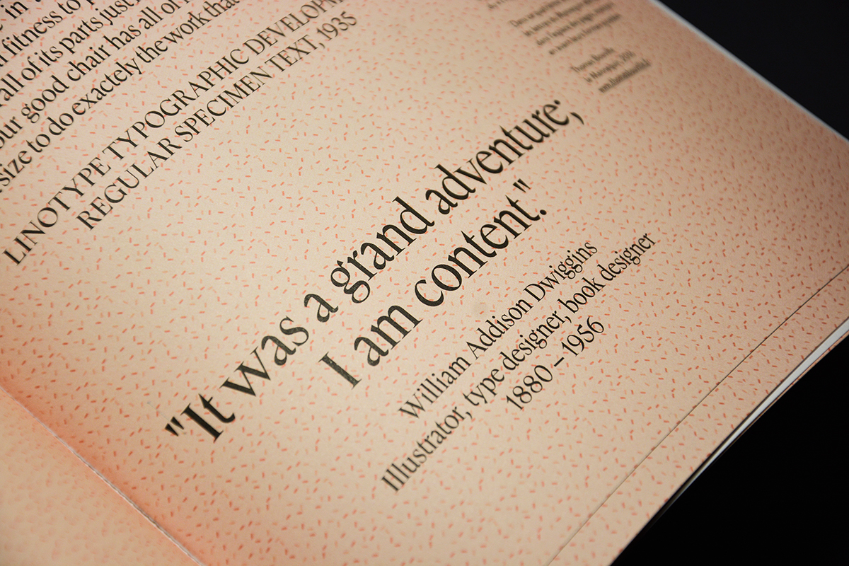
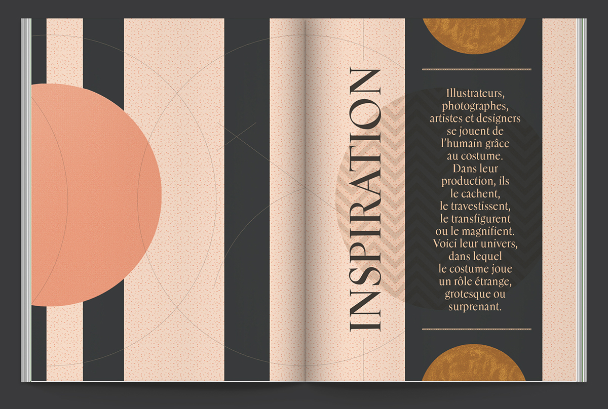
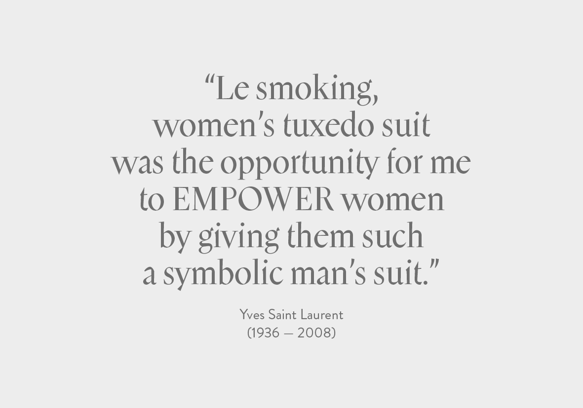
Thomas Bouville has designed the Mannequin typeface for Cercle n°4:Costumes. Drawing inspiration from the cover of the book entitled Marionette in Motion conceived and written by William Addison Dwiggins in 1939, Mannequin is characterised by exacerbated shapes. The author is famous for having established relations between the way of drawing characters and the way of producing theatre puppets to make them visible on stage. To increase readability, the letters’ shapes, like puppets, tend to overdo some of their formal characteristics like the sharp downstroke of the “m” or the thick terminal of the “t” for instance. In this fourth edition, Mannequin’s letters parade along the pages, highlighting their adjusted shapes.
Cercle n°4: Costumes is available in full-english on our partner’s website IdN > www.idnworld.com/extra/extra13


Thomas Bouville’s website: www.thomasbouville.fr
© Cercle Magazine
